Learn How Spidergap's Feedback Reports Lead to Bigger ROI
Badly designed reports can seriously harm your 360 project. We worked with over 150 HR directors, managers and employees to perfect ours
The end goal for 360° Feedback is typically to support employees in prioritizing, planning and taking action on the areas that need it the most.
Surprisingly, most 360 Feedback reports do a really bad job at supporting this goal.
At Spidergap, we worked with over 150 HR directors, managers and employees to design a feedback report that revolutionizes how 360° Feedback can be shared. You can check out our 5* customer reviews to see the impact this makes.
In this article, I'll explain how other reports fail to support the person being assessed, and how we've fixed that.
Where other reports fail
Most 360° Feedback reports make the mistake of thinking more information is better. It's not uncommon to see reports that weigh in 30 pages or more and require a trained coach to help the employee interpret the data.
If you've previously tried other 360° Feedback tools, then the reports below will no doubt feel familiar. But, as highlighted in red, they're plagued with some serious issues.
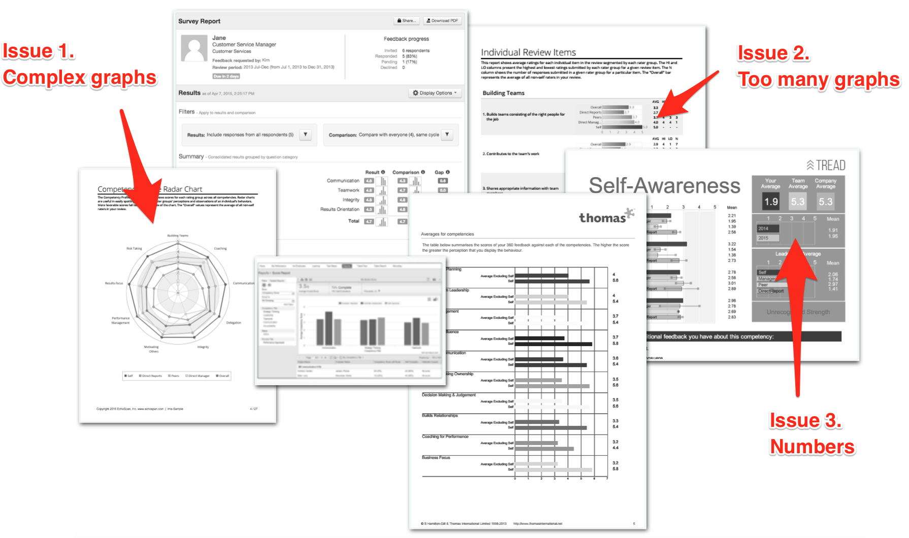
Issue 1: Complex graphs
Depending on how much you love data, you may or may not find the spider/radar graph to be useful. In the right setting, they're a really powerful way to share a lot of information and we actually included some in our early designs.
When reviewing these graphs with employees at every rank, we found that 10% love these graphs and 40% think they're OK. Unfortunately, the remaining 50% find these graphs really confusing and end up distracted from reviewing the rest of the feedback and making a plan!
It's possible to get around this by training the employee or the coach to interpret the feedback reports. But, frankly, this shouldn't be needed.
Issue 2: Too many graphs
In a good report, every graph gives one message clearly, and the person reviewing it understands how they're meant to use the information.
Here's how we present your top areas to improve:
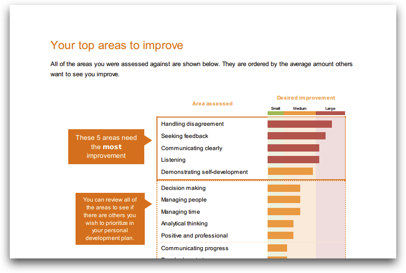
Note the page title, the clear explanation, and how we focus your attention on the top 5 areas rather than suggesting you need to review everything.
In a bad report, a hundred graphs gives the reader a headache and little idea of where their priorities should be
Issue 3: Numbers
Numbers aren't needed in order to show you which areas need the most improvement. In the screenshot above, you'll notice the only number is in the "These 5 areas need the most improvement" callout!
Not only are they not needed, but they can actually be very harmful to your project. They often lead to people over-analyzing their reports and comparing with others (bad idea!). This leads to unnecessary antagonism and conflict.
How our feedback report works
We've designed a friendly, useful and action-oriented feedback report.
The entire report can be summarized in just 4 pages:
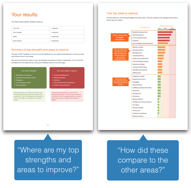
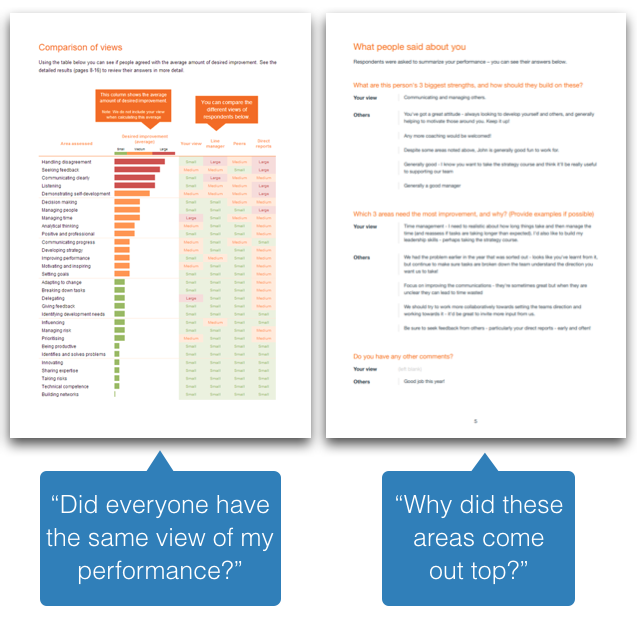
Note: If desired you can also add a section that focuses on strengths to help the employee identify how to play to these.
This summary supports our goal of helping the employee to understand and prioritize which areas to focus on.
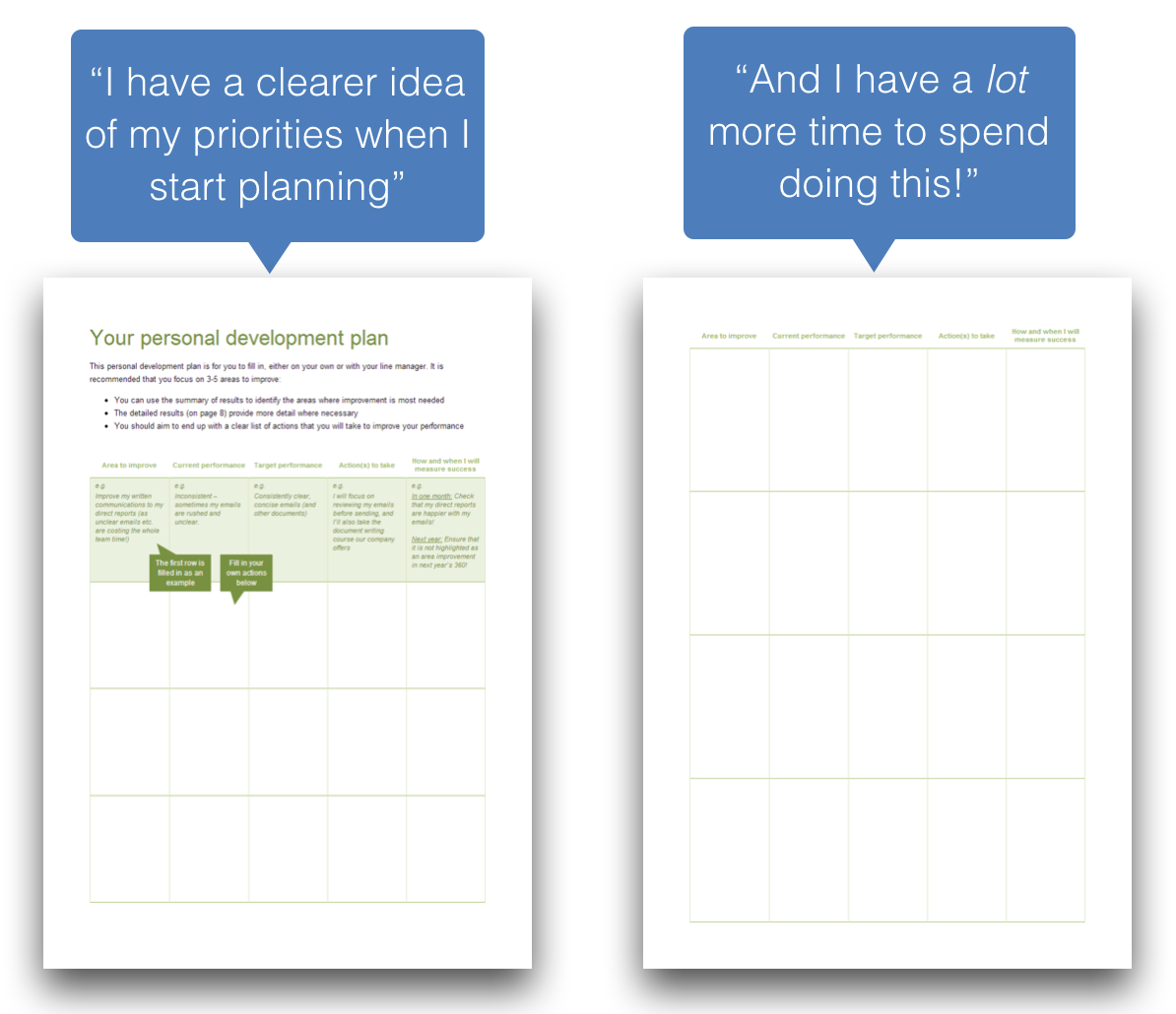
So, we then lead them straight onto creating their Personal Development Plan:
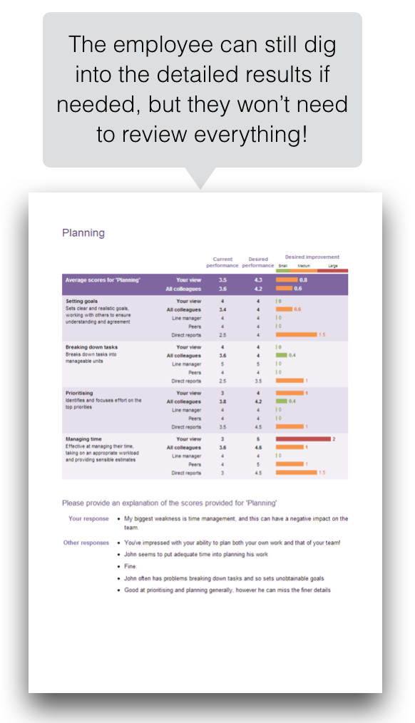
Finally, we do include the detailed results as an Appendix. We still make it easy to understand and use, but we don't suggest that the employee needs to review everything in it!
What's the impact?
With clear feedback reports, you'll find:
-
The employee’s more likely to understand their priorities
-
The employee’s more likely to take action
-
The employee’s more likely to see an impact
-
You are much more likely to get a return-on-investment.
Download a sample report
You can download our sample report here: https://success.spidergap.com/Spidergap-Sample-360-Feedback-report.pdf